Getting Along With Your Roof Color
Why is the title of this page “getting along with your roof color”? It’s very simple, there are some things in this world we can change and some which we may not be able to...your roof color most likely falls into the latter category. A good roofing job can last 30 years and is a major investment so unless you have the need to repair or replace, the color is here to stay.
Depending upon the style of your home, your roof will present varying amounts of itself to you as you view your home from the street. Styles of homes such as Cape Cod or Gambrel will have a large percentage of singles represented as the total face of the building. Can you see how important it is and just how critical it is in some instances to place the consideration towards your roofing as primary? Check out this blog for some helpful points of consideration.
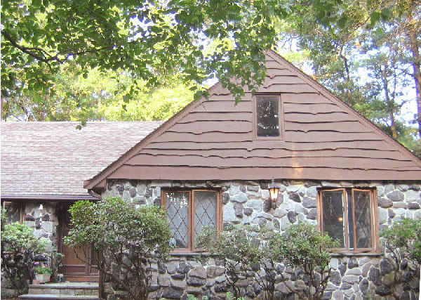
First, a sad tale of woe! As a designer, I am constantly stimulated by new ideas for color and composition. One of my latest obsessions is to give my 35 year old house an extreme makeover. Here’s a photo…

As you can see it has a large surface area of roofing and there are many angles to it making it quite dominant. Also (here’s the sad part), it’s brown. . Nothing wrong with brown mind you…it happens to be just right for the type of siding on my house and its setting. It’s just that I want to replace the siding with a cedar shake look.

in a light warm putty color and cover the driveway with white I should be careful what I wish for though because this roof is original to the house and most likely not long for this world…that’s good for the makeover except I’m not sure I’m ready for the financial commitment.
This is an instance where the roof color forbids me from choosing a palette other than browns or warm colors. Even worse, the siding on the house really can’t be anything other than brown as the rough board siding is supposed to look like logs (which they are, lol)…more about that later though.
Your roof will set the tone…here are some guidelines for colorway combinations; these are generalities and there will be exceptions but this is a place to start!
Roof Color Green-Gray
Here there are many color variations, in my experience most of these green-gray shingles seem to be on the cooler or bluish side of green. Red, red-brown or any beige with a rosy undertone is not good with this…the complimentary color scheme (red and green are compliments) will only exaggerate each other. Also be wary of choosing a green that has a different undertone than that of your roof. For instance, your shingles are towards the bluish side, a bad choice then would be an olive green…make sure your undertones agree. Green is made from mixing yellow and blue. The ratio of those two colors in the mix will determine whether your green is toward the yellow (olive) or the blue (spruce) side.
Roof Color-Red
Make less of this very assertive color roof by putting more red with it. Believe it or not, putting a contrasting color with the red will only make it look more like what it is. Especially bad would be any sort of gray. Because of the laws of optics, the gray will assume the compliment of the red resulting in a Christmas tree palette…not good unless your last name is Claus. Try some rich and deep red-browns here.
Roof Color-Brown
I’ve already told you about my personal dilemma but generally any sort of brown or beige with yellow undertones will look great. Be careful of taupes, they often have a pink, violet or blue undertone which will rise to the surface when paired with the warm brown roof shingles.
Cedar Shakes
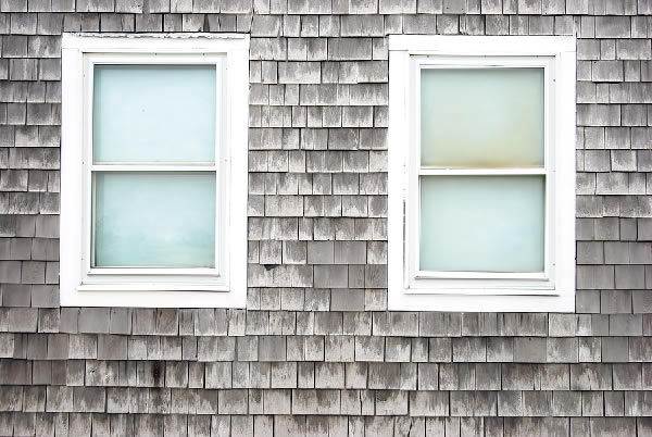
Everything goes well here as the shakes eventually weather to a silver gray
Slate Roof
Most of these roofs are dark enough to bypass any sort of color issues. If your particular roof is not, some choices are darker grays with violet undertones and grays with teal undertones.
Caution! A Reality Check
A word of caution when assessing your roof shingle color. An asphalt shingle is covered with pebbles; very often these pebbles are not uniform in color but are varied on the shingle. I have spoken to many homeowners who have told me that they want to pull this color or that out of the shingle for the siding of their house. This is your logical brain at work and not your visual brain. Your roof is not viewed at a distance of 18” where you can identify all those little pebble colors but rather at a distance of at least 15 feet away. All those pebbles that you thought were so important just disappear into a visual blend at greater distances. Your eye blends these colors all together to form a uniform whole…so while you are tempted to literally take one of those pebble colors and duplicate it on the siding; it’s not a workable idea. Instead your house color selection should be based on the visual blend you receive when looking at the house from the street. That’s reality!
Return to Exterior House Paint Colors Home Page
