Eye Candy, A Color Feast for Your Eyes!
What exactly is eye candy?

Eye candy is a term which has been used to describe something that is very nice to look at and packs a big punch in a little package. My definition of this term as applied to color design supports this because I think that bold color, even though it will be used in a very small quantity, will carry a lot of weight. Here’s how I see it:
Eye candy - a small, concentrated, and contained shot of color designed to satisfy our need for color without overwhelming
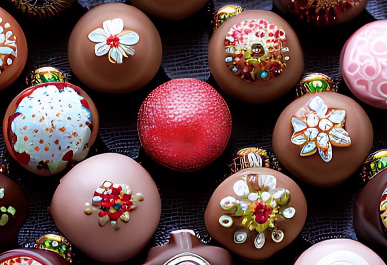
You know that giant bag of Halloween candy you buy every year…it’s so easy to pop a boatload of those little treats in your mouth. Now think of a really good piece of gourmet chocolate, you know, one of those little Belgian truffles.
It’s so rich that you really couldn’t eat more than one and not feel overdone. Well my ideas about using color are like those two very different pieces of chocolate.
Eye candy is bold but controlled. That’s the secret…little, concentrated…it knows its job and does it well.
Let’s say you love bright red and you’d love to paint your house red. Now think about the size of your house, maybe it’s two stories high. At any rate it’s pretty darned big and if you painted it the bright red you love, it would be way too much to handle. You can still have luscious color on a house without having light aircraft use you as a field marker…nor do you want to offend your neighbors.
Colors carry with them a visual “weight”. Some are more powerful than others. One of your ultimate goals in choosing house paint colors is to create balance. When you were a kid and played on a see-saw you had to move forward or back of the center to adjust for your weight against the person on the other side. Putting color on a house is like that too.
A beige applied to 400 square feet of house can be equal in “weight” to a 20 square foot door painted in your favorite bright red. That 20 square feet of door, like that Belgian truffle can satisfy your need for luscious color. It won’t overwhelm because it’s not that big and it’s bordered on all sides by either the house color and/or trim color…it can’t get out and hurt you! ! I am being silly but what I want you to know is that you shouldn’t be afraid of using strong color in small doses. A skilled colorist knows how to balance elements on a house in this way.

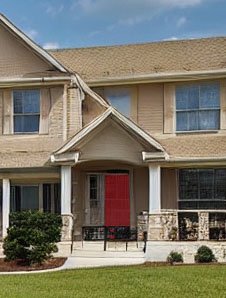
This is quite a large home which is basically monochromatic...it is all beige or close variants thereof. The exception is the brightly painted front door. It is brighter than I would ordinarily specify but it is always in the shadow of the portico. Additionally it is a very small feature on a very large house which is set far off of the road. In color, one size does not fit all. This tiny red spot on the house is just as powerful as the rest of the facade...color has weight.
Using color in small, measured and controlled doses like this is successful when applied to doors, window boxes, and some trims such as found on Victorian style homes. You also can use the principle of eye candy with containerized plantings such as bright geraniums in a grouping on your porch. Maybe a colorful flag or wind sock is to your taste.. Decorations and plantings allow you to work with the seasons and the differing types of light you might encounter depending on your location and time of year.
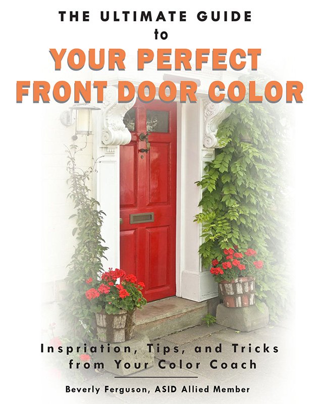
It doesn’t have to be paint although most often it is. Using eye candy is fun and gives you flexibility. Painting a door is a quick and easy project which can freshen up your look. Don’t be afraid to use bright colors. While bright colors up close can seem scary, remember that your house most likely will be viewed from the street which may mean 60 feet or more from the curb. It’s like the actress with her stage makeup, positively frightening, but she has to be seen by the person in the very back row of the theater. The color that you think is so bright up close will diminish when viewed from far away. Remember this, when it comes to using bold color, less is almost always more and should be used with balance and scale in mind.
