Professional Color Measuring Tools
Using tools is one of the things which sets us apart from the rest of the animals on this planet! If you want to get a color job done quickly and efficiently then using the proper professional color measuring tools will get you to that place.
Color experts use several different calibration methods to help them in their work. A few are complex and beyond the scope of these pages but for everyday use, there are three tools which are the workhorses of every color specifier...these are;
1) Professional Color Measuring Tools-The Fan Deck

2) Professional Color Measuring Tools-The Color Wheel
3) Professional Color Measuring Tools-The Value Scale

The Paint Fan Deck
Lets start with the fan deck first...this is probably the tool which most folks are familiar with and which many own or have used. I like to say that the fan deck is a dangerous weapon in an untrained hand. Why do I say this? Well a fan deck contains thousands of choices.
Unless you have a road map, looking at a fan deck is a bit like looking through a world atlas. All of these colors are tiny little chips, not only that but they are juxtaposed with their other color cousins on the same strips. Color often doesn't scale up in the way you think it will from the tiny chip to a big house. Also, the placement of the colors next to each other on the strips can alter your perception of those colors. There is hope however!
Each paint manufacturer organizes their palette differently. I favor the Benjamin Moore Classic Collection for the bulk of my work. The front of the deck is composed of higher chroma (intensity) colors. In the middle are whites and off-whites and then the deck repeats itself to the end with lower chroma versions of what is in the front of the deck. I think it’s brilliant in its organization. It makes it very easy to find exactly what you are looking for.
I can’t advocate enough for the importance of genuine paint color samples to reference. The convenience of today’s digital world has everyone looking at colors on their phones. That’s fine if you are designing for digital but if you are trying to decide on a paint color, your judgement will fall flat…here’s why:
- Computers, TV’s, and phone screens use direct light to image. They use an additive color model called RGB (red, green, blue). All those colors mixed together in light make white.
- Paint pigments use a subtractive color model. All the colors we see with pigment are filtered…red paint isn’t red, it is paint which absorbs all colors but red. The red you see is reflected color. All pigments mixed together in theory make black.
This is complicated but the bottom line is that you can never compare pixels on a screen to real paint…they just don’t start from the same place. Add to that the quality of the calibration of your screens, they are calibrated, yes?
If you want to understand the difference between pixels and pigments, here is a website which does a good job of explaining.
Get yourself a fan deck of paint samples and one of off-whites as well. It will make your life so much easier. I prefer using Benjamin Moore because they are the only paint company to manufacture their own tints. This gives them the ultimate control over consistency in color and performance. I am not compensated in any way to say this…I just like their paint.
The Color Wheel
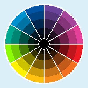
A color wheel is also a very familiar tool. The color wheel used by the pros however is a bit more complex than the one you used in grammar school. The pro version contains not only the saturated or pure versions of the visible spectrum but also contains the tints (colors mixed with white) and tones (colors mixed with black). It is simply an expanded and more realistic version of the wheel we know best. The beauty of this tool is that it is intuitive to read, it’s pretty straight forward. What it doesn’t spell out is the relationships between colors and what they mean.
On the wheel there are opposites (compliments), cousins (analogous) and tints and tones of the same hue (monochromatic). There are also other schemes but for most purposes, colorists depend on these blueprints. Why did I call them blueprints? Well because drawing the relationships between colors on the wheel is a bit like your road map I spoke of before. Using a complimentary, analogous or monochromatic formula is a blueprint for success. They are templates which will enable you to establish workable and solid palettes for your home or any other application.
A complimentary scheme is one which uses colors which are directly opposite from each other on the wheel…i.e red/green, blue/orange, violet/gold. Complimentary schemes are the most dynamic, they are energetic and lively.
An analogous scheme uses colors to the immediate right and left of the chosen color to comprise the palette. I like to think of the wheel as a pie and an analogous scheme as a wedge shaped piece out of that pie. Analogous colors are like your cousins, you look like each other yet you are individuals, and you play nice together. Analogous color schemes are restful. Furthermore, they are simple to construct because you are not matching, instead you are coordinating so this gives you way more latitude in picking colors. Analogous schemes work best with 3-4 or more colors.
Monochromatic schemes are perhaps the easiest to understand but the most difficult to use because they rely on subtlety to be effective. They are the “quietest” color schemes you can construct. When executed correctly, they are sophisticated and stunning in their simple beauty.
The Value Scale
The concept of value in a color is the last thing you learn at art school. It is a somewhat elusive idea to follow so hang on for the ride!
Value refers to how light or dark a color is. Many people confuse chroma or intensity with value. Chroma or as it is sometimes called, intensity, refers to how muted or how pure a color is.
A color can be dark but muted. Many folks, because they don’t have a color vocabulary, say that a color is too dark when they really mean it is too intense.
So understanding value is really the key which will set you free and enable you to put color in place correctly the first time.
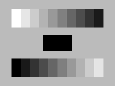
Designers imagine the world as a black and white photograph…all colors are therefore some sort of gray. Designers then divide this black and white world into 10 steps where the number 1 represents white and the number 10 represents black. In between are the other 8 steps of gray. Imagine a telephone pole with white at the top and increasingly darker steps of grays at even intervals on the way down to black. This is your value scale….and this is how you use it.
Because color is relative, that is each color derives its character from the color it is placed next to; colors can be made to appear lighter or darker than they really are depending what they are placed against. This is perception and is something that changes. This is what fools most people when choosing their house paint colors. But, if we can scientifically assign a numerical value to a paint color which remains constant, then we can always be accurate about specifying color.
Using a value scale is fun, easy, and enlightening. They are usually high quality inks printed on a heavy card stock and are readily had.
Lay the value scale out and gather your color chips. Don't cut up your fan deck!!!
Until you become very skilled, cut the chips off the card and trim the white border away from them until you are left with only the pure paint color chip. Now squint very hard and move the color along each of the gray strips until you arrive at the gray strip which presents the least contrast between it and your color. This is the place where the border between your paint chip and the gray strip is the fuzziest or hardest to read. You absolutely have to squint for this! When you arrive at the gray where this happens, then you have your value established for your color.
So let’s say you have a blue which is a value 3…a medium/light blue. When you bought some of this paint to sample against your currently white house you thought it looked too dark. This is a false note (remember your perception) because you are comparing a color against a lighter one. Anytime you do this, the lighter color will look lighter than it is and the darker of the two will appear unnaturally darker.
This has to do with your eye’s physiology and the way you are able to see color and contrast….don’t worry about knowing this. All you need to know is that in the entire scheme of things, your new color is a “3” . Once you get the entire house painted, that frame of reference between light and dark will not be there and your new color will read correctly. This is why understanding value is essential in being able to pick colors.
Understanding the value tool is the biggest step you’ll take towards accurate reading of color.
So now you have all the tools you’ll ever need to do the job right but like any professional level instrument, it takes practice to develop skills. So please don’t be daunted if you don’t grasp all of this right away. Color theory is very complicated and I have attempted to distill it down into a few hundred words. It is my life’s work and after many years of practice, I am still learning so I don’t expect any of you to jump right on.
You will however gain a mastery over something which formerly seemed so very elusive, this a guarantee. But be careful about telling your friends, family and neighbors because you will become the most popular person on the block and the one that everyone wants to talk to you about their “colors”…be careful what you wish for!!!
Working with and reading about color is fascinating. Here is a good website with easy to understand descriptions of these concepts.
Return to Exterior House Paint Colors Home Page
