Decision Time for House Paint Colors

OK, so you’ve read all the articles and applied all the science. Now it’s time to put the rubber to the road, it’s decision time. Theory is marvelous but you sometimes just have to test it out. Unless you are a skilled and experienced colorist who works with paint daily, you will most likely want to get a quart or two of paint and apply it to the house just to be sure.
Instead of paint sampling your house, use a large piece of cardboard instead. In this way, you can move the intended color from side to side to see how it looks under different lighting. Darker colors look the most different between shade and sun, light colors do not change that much. Make sure you double coat the cardboard to assure getting an accurate color reading.
Because color is relative, (color derives its appearance based on the other colors that surround it), you will have a hard time separating the new trial color from the existing house color.
Just the other day, I specified a medium-light beige for a client. They had an existing yellow. Against the yellow, the beige looked very dark and somber. Just about everything looks dark and somber against sunny yellow. However against my navy blue shirt, the beige looked very light. My clients were amazed at this demonstration and how the appearance of the beige could be so easily manipulated.
Now I did say “appearance”…that means we’re talking about your perception, not your reality. I have a tool which will help you to understand the truth about the colors that you choose.

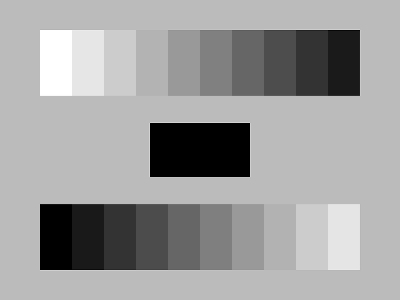
The two smaller inner squares are the same color but appear different because of their relationship to their surrounding colors. Color does not exist in a vacuum.
A very fun page illustrating how
your eye plays tricks on your brain!
How can you overcome “perception” and all its tricks so that you can
accurately pick good colors when
decision time arrives?
Color specifiers and artists use a tool called a value scale . A value scale is a piece of cardboard printed with a series of graduated gray strips, white and black in a 10-step system. You can pick one up at any good art store.
The number “1” is represented by white and the number 10” by black. In between are steps of grey from light to dark. What specifiers and artists do is to think of all the colors of the world as if they were photographed by black and white film. Every color then becomes some shade of grey. A standard 10 step system is used so that color specifiers everywhere are using the same measuring tool…it’s like a ruler for colorists. We call this measuring system the “value” of a color or how light or dark it is.
Here’s how it works…
Take your color and put it up to each of the grays on the value scale. Squint hard while you do this, you will eventually come to a grey strip where the line between it and your color sample is fuzzy, that is there is little contrast. Whatever number that particular gray strip is, will be the value of your color. What does this mean??? Well, if you know that the blue you’ve chosen is a value 4, you’ll see that it’s not even halfway to being black. It may look like a dark sample when you compare it against your light house but that is a false note.
Once you get your entire house painted, your perception of it being a dark color will disappear since you will no longer have a large light wall to compare it against. A color that is assigned to a value number remains the same number no matter what you put it up against.
The value assigned number is constant, the perception is not
A value scale will help you to understand just how light or dark your chosen color is no matter what it is viewed against.

classic value scale
Some colors can run the range from 1 to 10…those that can be very light and very dark are greens, blues, and purples. Reds are no lighter than value 5, they range from 5 to 10. There is no such thing as a light red, a light red is called “pink”. When clients say they want red but they don’t want a dark color that is impossible. Also, there is no such thing as a dark yellow, yellows range from 1-2 ½ on the value scale.
If you understand nothing else about assessing color, having a grasp of how to use value when choosing color will be more useful than anything else. It will help you to be accurate and not to get those surprises everyone has experienced between the journey from color chip at the paint store and application on your walls.
Remember too that the nature of outdoor light is far more intense than any you will find at the paint store. Colors tend to look 1-2 steps lighter (on the value scale) outdoors than they do inside. Also dark colors are more apt to show differences between shade and shadow sides than will light colors. This is not a bad thing, just something for you to enjoy or avoid depending on your point of view and sense of adventure. Using this bit of science we call value will make your decision time a success.
Return to Exterior House Paint Colors Home Page